


With food packaging, there are so many decisions that need to be made. For instance, you have to use FDA-approved materials. These materials need to fit your budget. The packaging needs to protect your product. The labels have to include bar codes and nutritional information. And, of course, the package needs to be attractive and appeal to your target audience.
Using color strategically can help you make a bold statement and entice new customers. Most customers only take about 25 seconds to select a product from the grocery shelf, so you only have a few seconds to make an impact, which why color choice can be important. We’ve studied up a bit on colors, their meanings and their psychological impact on the consumer and here’s a quick look at what we’ve found.
The Psychology of Color
Color makes a big impact on the psyche, and studies have shown that every color evokes some sort of emotion or feeling. For instance, people associate red with energy, power, love and passion, while orange represents courage, success and confidence. Yellow is a cheerful hue that makes people feel happy, joyful and energetic.
Green and brown are colors most often associated with the outdoors and nature, but green also is associated with healing, cleanliness and freshness. Blue is a peaceful color that also implies integrity and loyalty, perhaps that is why companies such as General Mills and Quaker use it for their logos. Gold and silver tend to make people think about wealth and glamour, and black also tends to be a perfect option for an elegant, upscale or classy product. White symbolizes purity and cleanliness and often is associated with wholesomeness.

Food Associations with Color
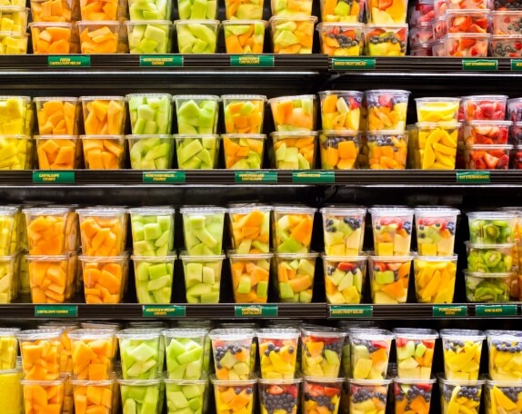
While understanding color psychology can be important, there are certain colors that tend to be associated with food. For instance, red and yellow have been found to stimulate people’s appetites. Consider fast food eateries such as McDonalds, Burger King, Sonic, Carl’s Jr., In-N-Out Burger, El Pollo Loco and Wendy’s. All of these establishments use yellow and red in their logo design. Many other companies, such as Arby’s and Jack in the Box, use red to grab attention and get people thinking about food. Orange also can be a good option, as it blends both yellow and red.
Of course, that’s just restaurants, right? Think about products on the supermarket shelf that use red, yellow or orange somewhere on the food packaging. For instance, cereal manufacturers such as Kellogg’s, Post and Nabisco all include a red logo. You might not want to overuse these bright hues in your overall food packaging design, but using a pop of red, yellow or orange or opting for a logo using these colors can attract attention.
Green also can be a solid choice, and often browns and other earthy hues. These can be good options for all-natural or organic packaging as they conjure up earth-friendly feelings in consumers. Although using earth tones for food packaging has become so trendy in recent years that you might consider alternatives to stand out from other “natural” products.
The Cost of Color Choice
Let’s face it, ink is expensive. Black ink is less expensive than color ink, so you might be tempted to opt for a black and white design, and we have seen some fantastic food packaging designs completely done in black and white. This can make your product stand out, but must be used with care. For instance, we wouldn’t recommend using black and white for a product geared toward children, who naturally are attracted to colorful packaging. But it can be a nice option for gourmet and high-end food packaging design.
One great way to save money and build brand recognition is to consider using black and one spot color. For instance, perhaps you sell fresh pasta. You might have several different varieties and use the spot color to identify each variety with your food packaging design. For instance, your basil fettuccine could feature a black, white and green label with green to represent the basil, while your butternut squash fettuccine could include a black, white and orange label. Your red pepper pasta label could be black, white and red.
Using several different colors might come with a higher price tag, but it can be the best option for some products. Again you might feature your logo in one solid color, and then identify the flavor or variety using a specific color. As an example, think about yogurt, which comes in a wide variety of flavors. You might have a red logo to attract attention and then use blue for your blueberry flavor, green for a kiwi flavor, yellow for a mango flavor and so on. No matter what colors you choose, we recommend keeping your logo the same on every type of food packaging you sell, as this boosts your brand image.

At Indepak, we may not be developing logos and labels, but we can help you with fantastic food packaging design. We have been creating plastic food packaging design for more than 50 years, and can create whatever you might need. This includes custom clamshell packaging, thermoform trays and tubs for everything from spreadable butter to yogurts. We can use a variety of FDA-approved materials, and we have many sustainable options for your food packaging design, so give us a call and let’s get started on your packaging project.